Key Takeaways
- Consistent branding and clear navigation are critical in a well-designed 404 page.
- A personal touch helps humanize the site and reduces user frustration.
- Helpful elements like search bars and curated links encourage users to stay engaged.
Encountering a “Page Not Found” error is a common frustration for users browsing any website. By leveraging a well-crafted 404 page design, brands can turn an unfortunate misstep into an opportunity to engage users, provide guidance, and maintain site credibility. For inspiring visual examples, explore this gallery of 404 page design solutions from brands across the web.
Instead of allowing the error to disrupt a user’s journey, thoughtfully designed 404 error pages can reduce drop-offs and even boost brand perception. The following guide covers the essentials of creating an effective 404 page, offering practical tips and real-world examples to help you turn setbacks into memorable experiences.
Understanding the Importance of 404 Pages
When a visitor follows a broken link or enters an incorrect URL, a 404 error page is their first stop. Far from being a dead end, this page can serve as a vital bridge, offering users clarity and keeping their interaction with your site positive. Clear communication is important, ensuring users know what happened without being overwhelmed by jargon or technical details.
Many site owners underestimate the impact of these moments, yet a generic or confusing error message can quickly erode trust, leading users to abandon your site entirely rather than search for alternative content.
Essential Elements of an Effective 404 Page
To prevent users from bouncing and to guide them back to valuable content, make sure your 404 error page includes these essential elements:
- Clear and Direct Messaging: Let visitors know what happened using straightforward language. Avoid complicated explanations or error codes unless they are absolutely necessary.
- Consistent Visual Identity: The design should match your brand’s typical fonts, colors, and style. A 404 page that feels disconnected from the rest of your site diminishes trust and expectations.
- Strategic Navigation Options: Direct users to key areas like your homepage, frequently visited categories, or trending articles to help them recover from the error quickly.
- Search Capability: Including a search bar empowers users to immediately find what they want, increasing the likelihood they’ll stay on your site.
- Engaging Visuals: On-brand images, illustrations, or even subtle animations make the page inviting. Visual cues help convey your message and soften the blow of landing on an error page.
Best Practices for 404 Page Design
- Maintain Brand Identity: Every touchpoint with the user matters and the 404 page should be no exception. Reinforce brand familiarity by maintaining consistent design choices across font, logo, and color palette. This visual consistency reassures users that they are still on the correct website.
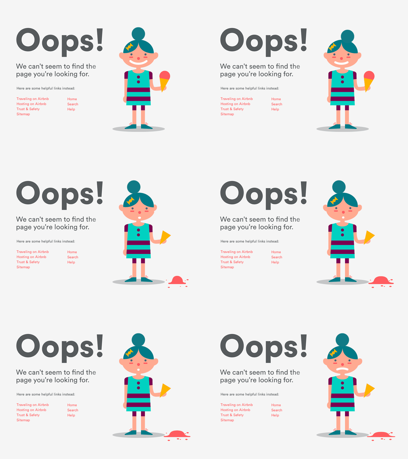
- Use a Friendly Tone: Whether it’s a witty remark, a lighthearted illustration, or a simple apology, an empathetic or playful approach can greatly reduce user frustration. An effective message feels personal and relatable, helping visitors regain their confidence in your site.
- Prioritize Usability: A great 404 page elegantly balances clear navigation and simplicity. Avoid overloading the page with unnecessary graphics or text. Highlight core navigational elements (such as a home button and a search bar) so users can quickly orient themselves and resume their journey.
- Test on All Devices: A common mistake is forgetting to ensure responsiveness. Test your 404 error page on desktops, tablets, and smartphones to confirm all features and links work seamlessly.
Examples of Creative 404 Pages
Some organizations use humor, playful graphics, or interactive features in their 404 pages to create a memorable impression. For example, Pixar’s 404 page features a disoriented character, which aligns perfectly with their brand voice and user expectations. GitHub once featured the famous Mona the Octocat lost in space, making light of the situation while offering quick navigation options. These pages not only acknowledge the inconvenience but also entertain and guide users effectively.
Common Mistakes to Avoid
- Default or Technical Jargon: Relying on a basic, generic message (such as “404 Not Found”) can be confusing and unhelpful for visitors who don’t understand what the error means.
- Missing Navigation: Failing to provide links or a search function leaves users at a dead end, often increasing bounce rates and resulting in lost opportunities.
- Poor Visual Consistency: A mismatch in design disrupts the user’s experience and can make your site feel unprofessional or incomplete.
Conclusion
Transforming a 404 error from a frustration into an opportunity requires a strategic approach to both messaging and design. By maintaining visual consistency, guiding users with clear navigation, and injecting a bit of personality, you ensure errors do not lead to lost visitors. These pages are much more than placeholders; they are an important element in delivering a smooth, user-friendly web experience that builds trust and loyalty.